January 2020
Butter Press is a magazine that aims to provide an inclusive space for queer, transgender, and non-binary individuals. They were founded in 2018 and were looking to get a new and clean logo. Butter Press often adopts a new visual style that corresponds with each issue they release, so they wanted a logo and could be easily added to any issue they produce, no matter the style or colors used.

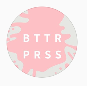
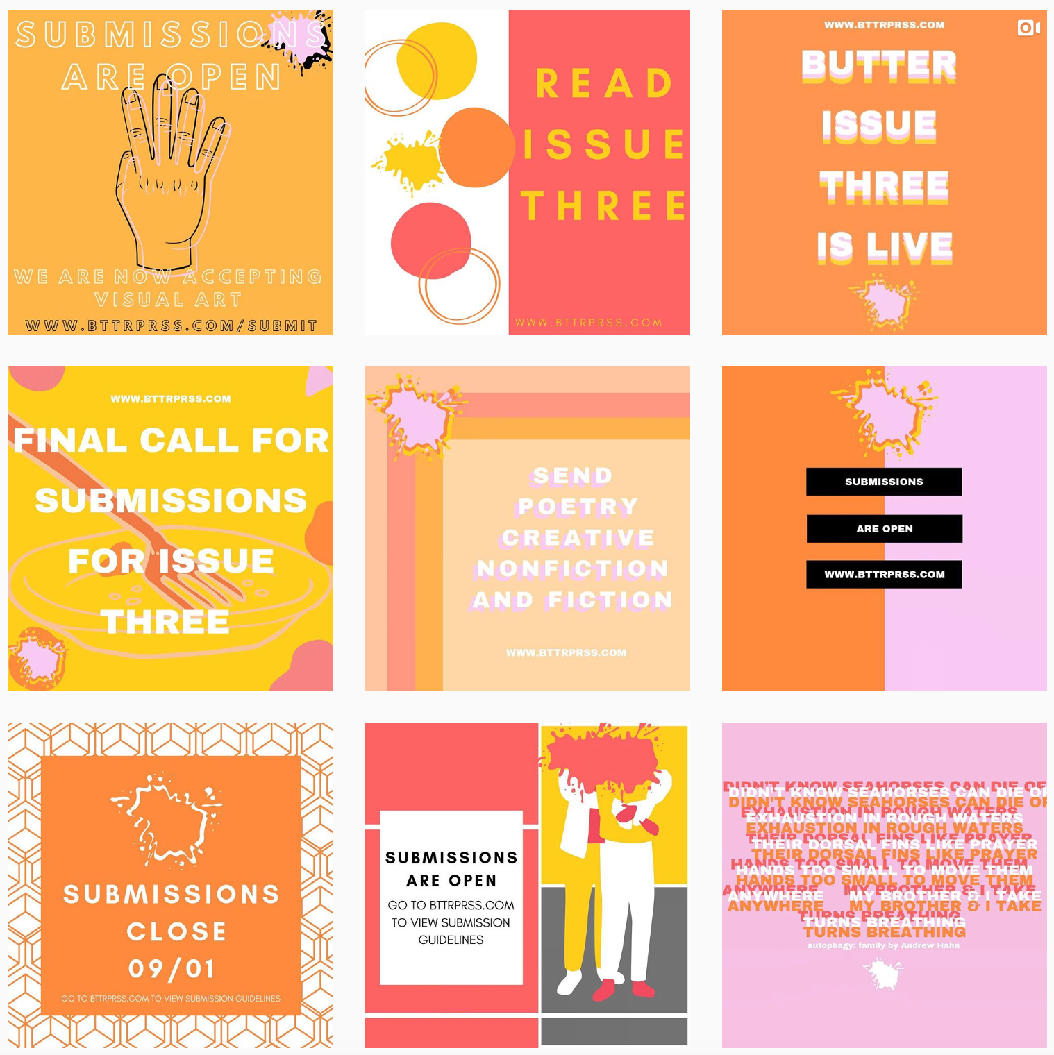
Their original logo and brand identity was very colorful and utilized this "splatter" imagery as a logo bug often.

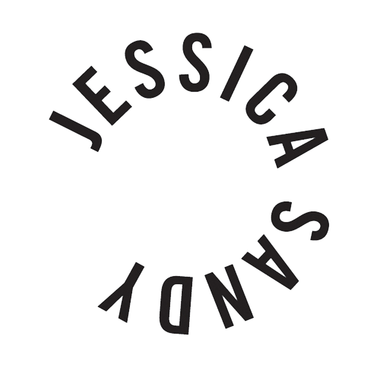
Butter Press provided me with some "inspiration" logos that they liked the direction of.

Following the original colorful direction of Butter Press' branding, I provided them with a variety of 1st draft options that could be easily integrated into their existing feed and brand presence.
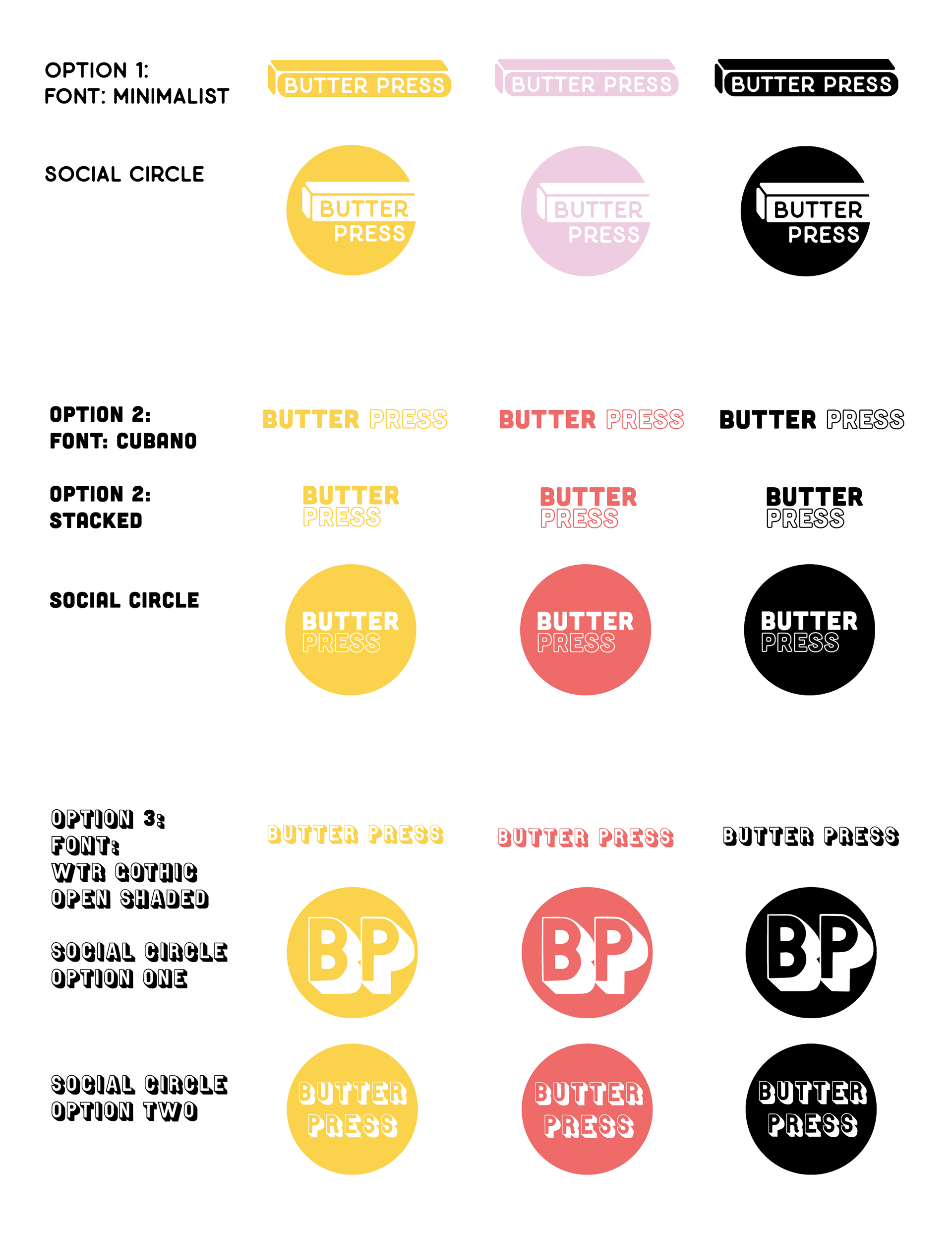
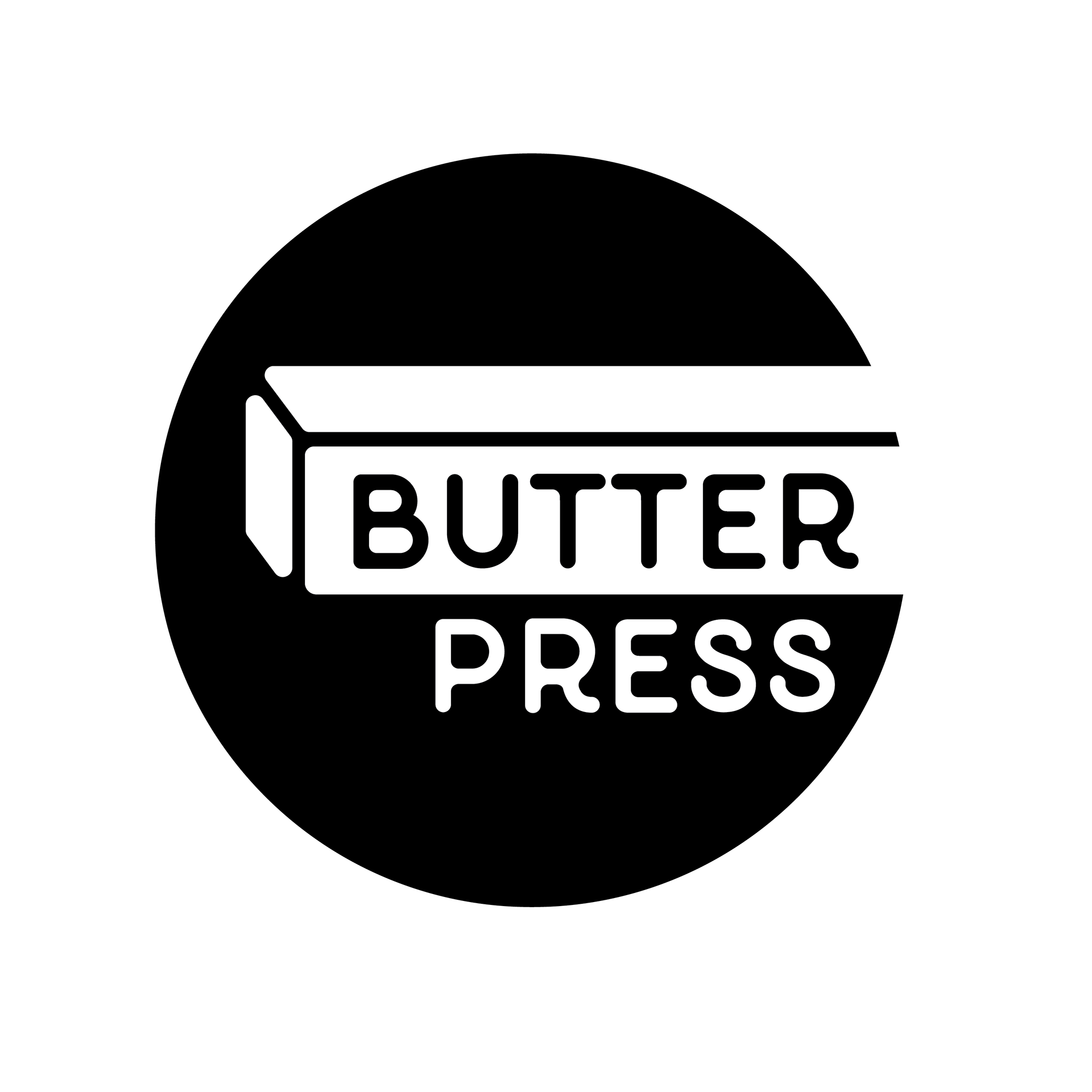
They immediately responded to the very literal option no. 1 featuring an abstracted stick of butter, and surprisingly liked it best in black. From here I provided them with a variety of other options featuring this design direction with some reasoning to back up each design choice.
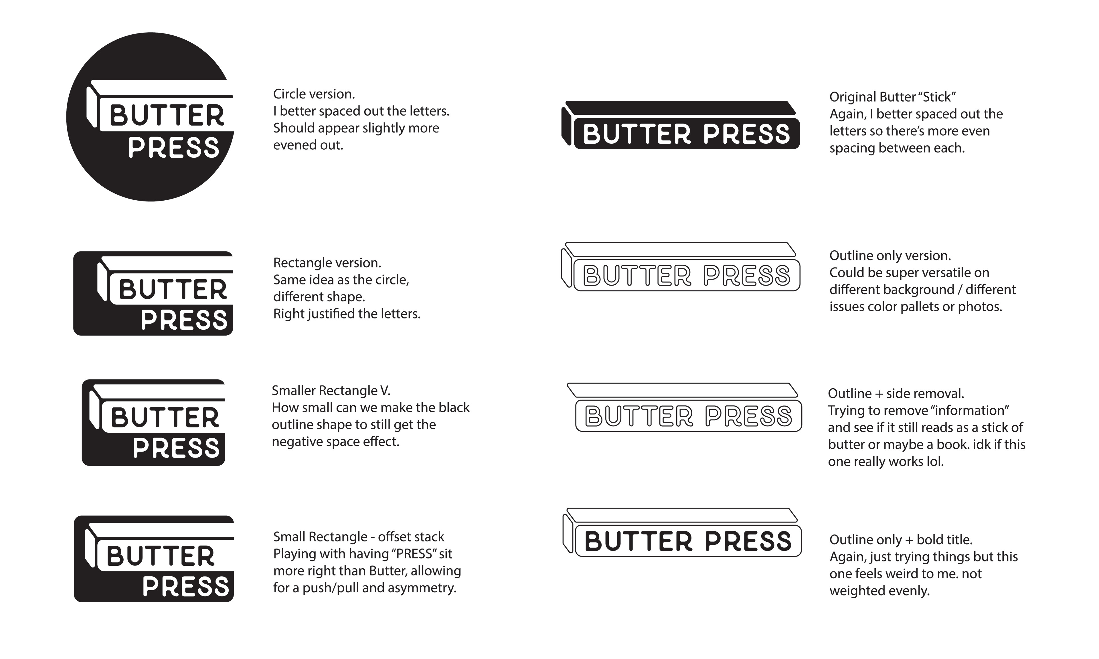
With some subtle spacing edits, they went back to their original choice, a simple black circle logo that's bold, clean, and extremely versatile!