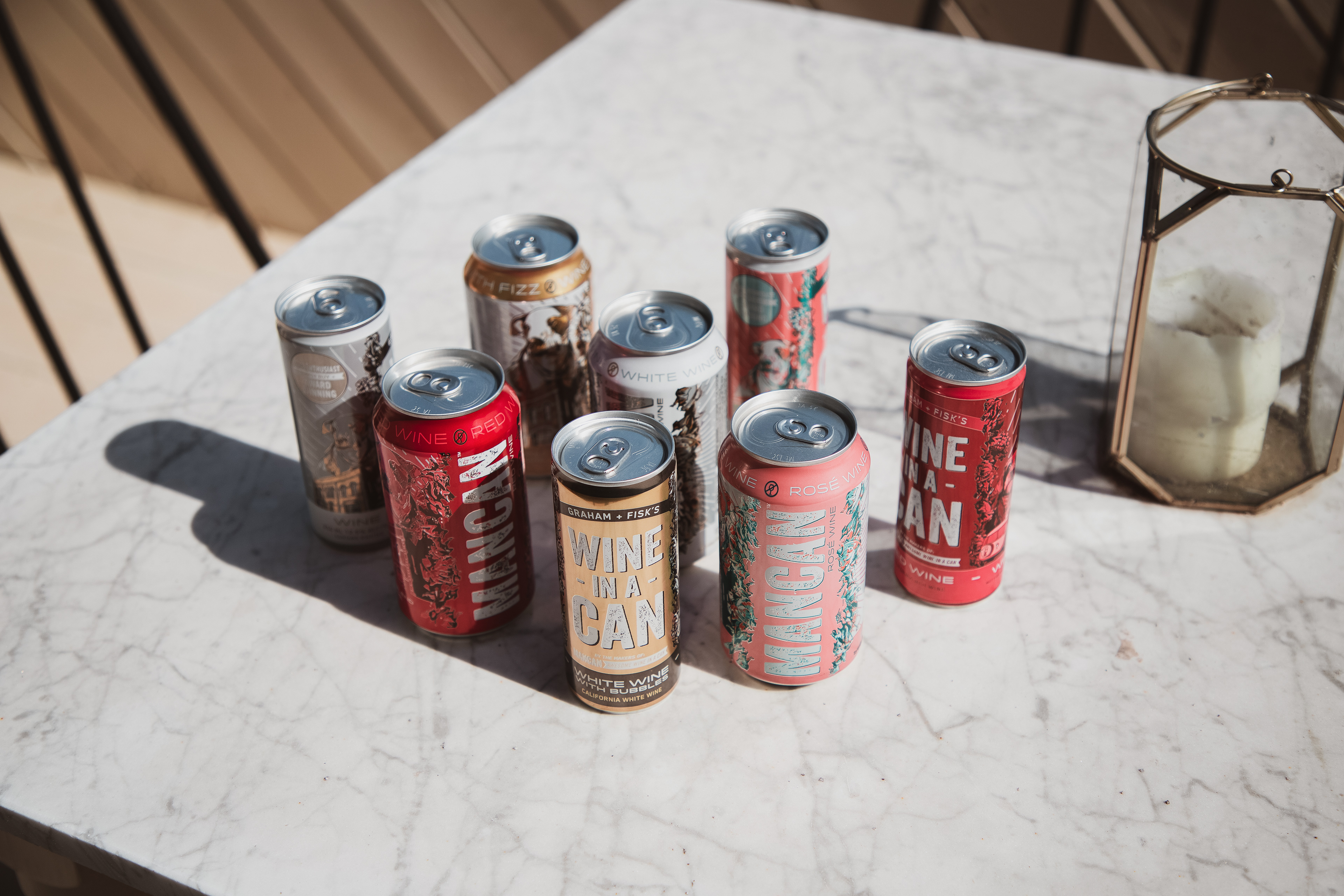
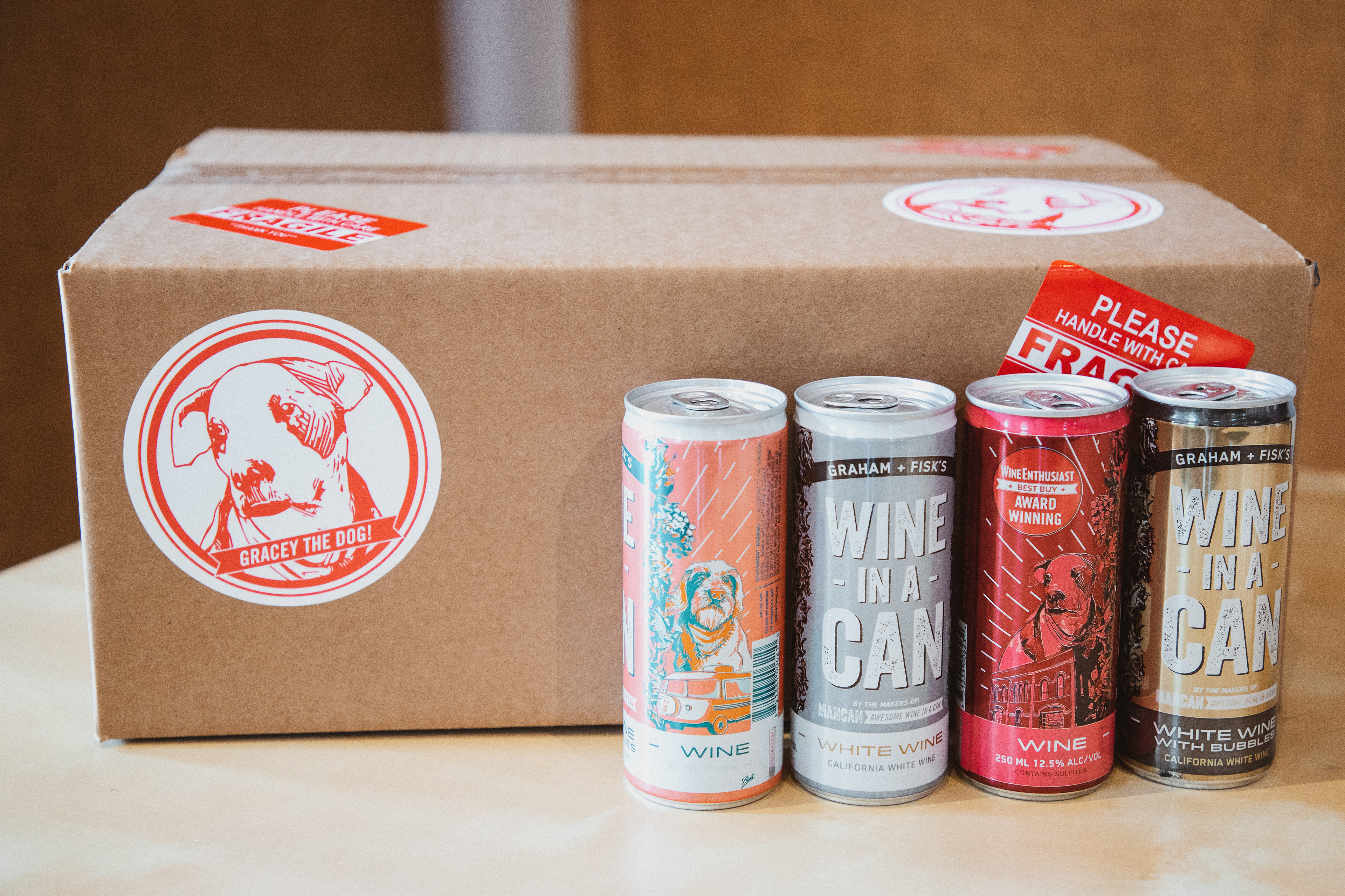
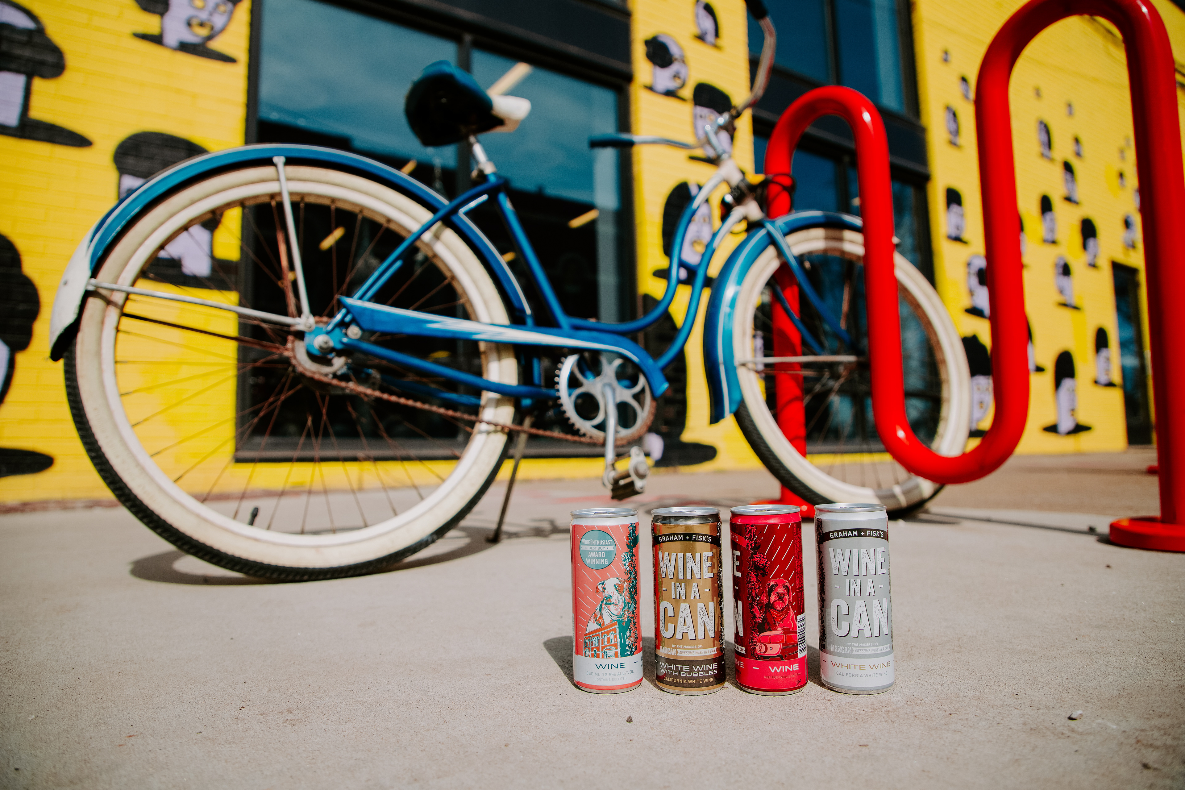
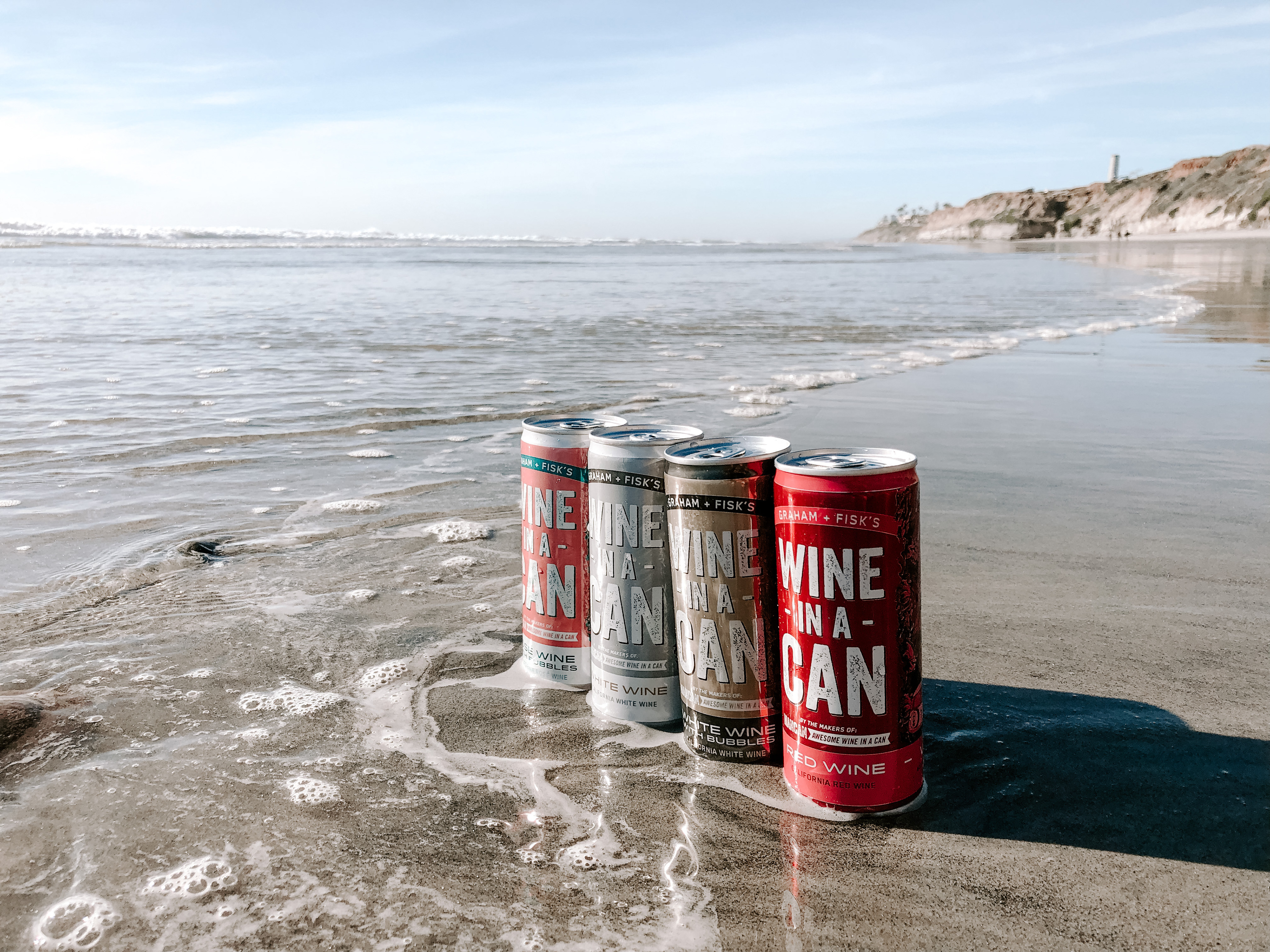
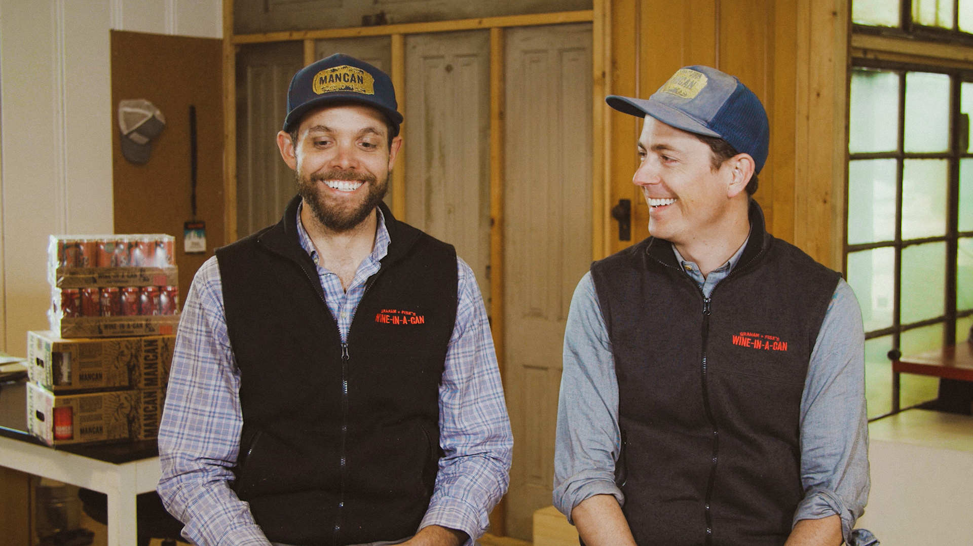
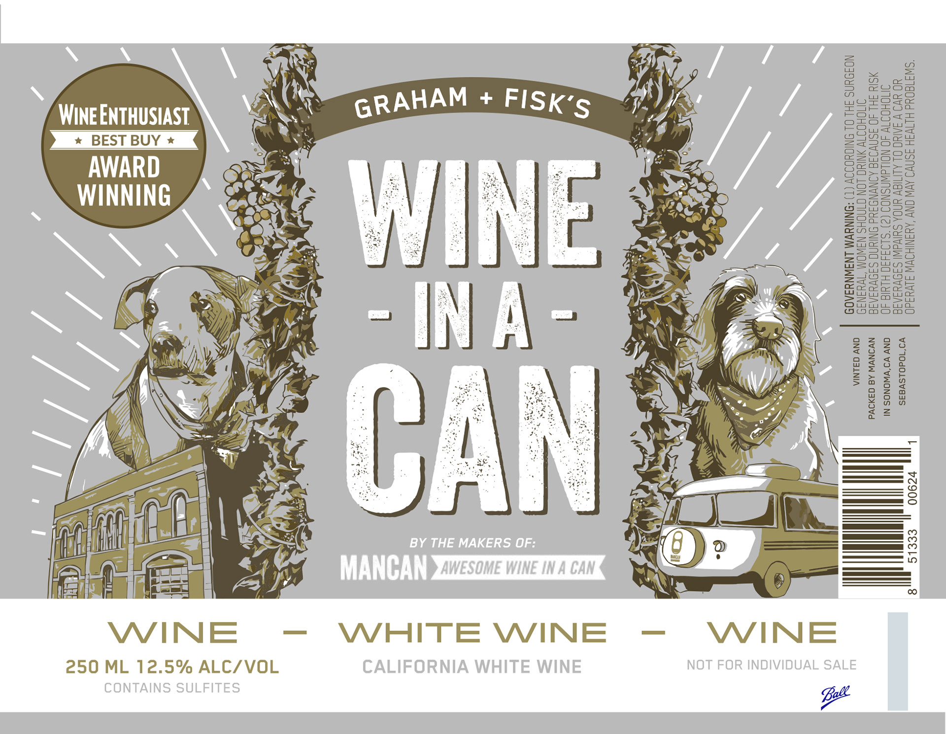
Graham + Fisk's Wine-In-A-Can is the "little brother" brand to MANCAN Wine. Both are under the parent company umbrella of Firehouse Can Co. Graham + Fisk's is California Wine in 250ml cans where MANCAN is larger in 275ml cans.
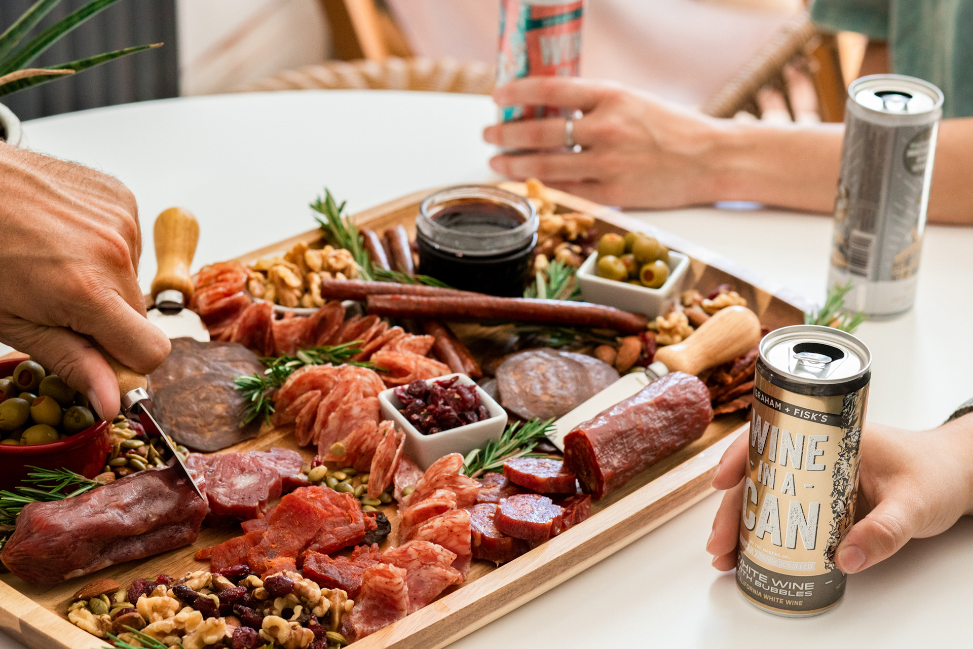
G+F's was always meant to feel like part of the same family as MANCAN, just slightly softer and with more of a story element driving the brand's messaging, imagery, and overall feel of nostalgia.
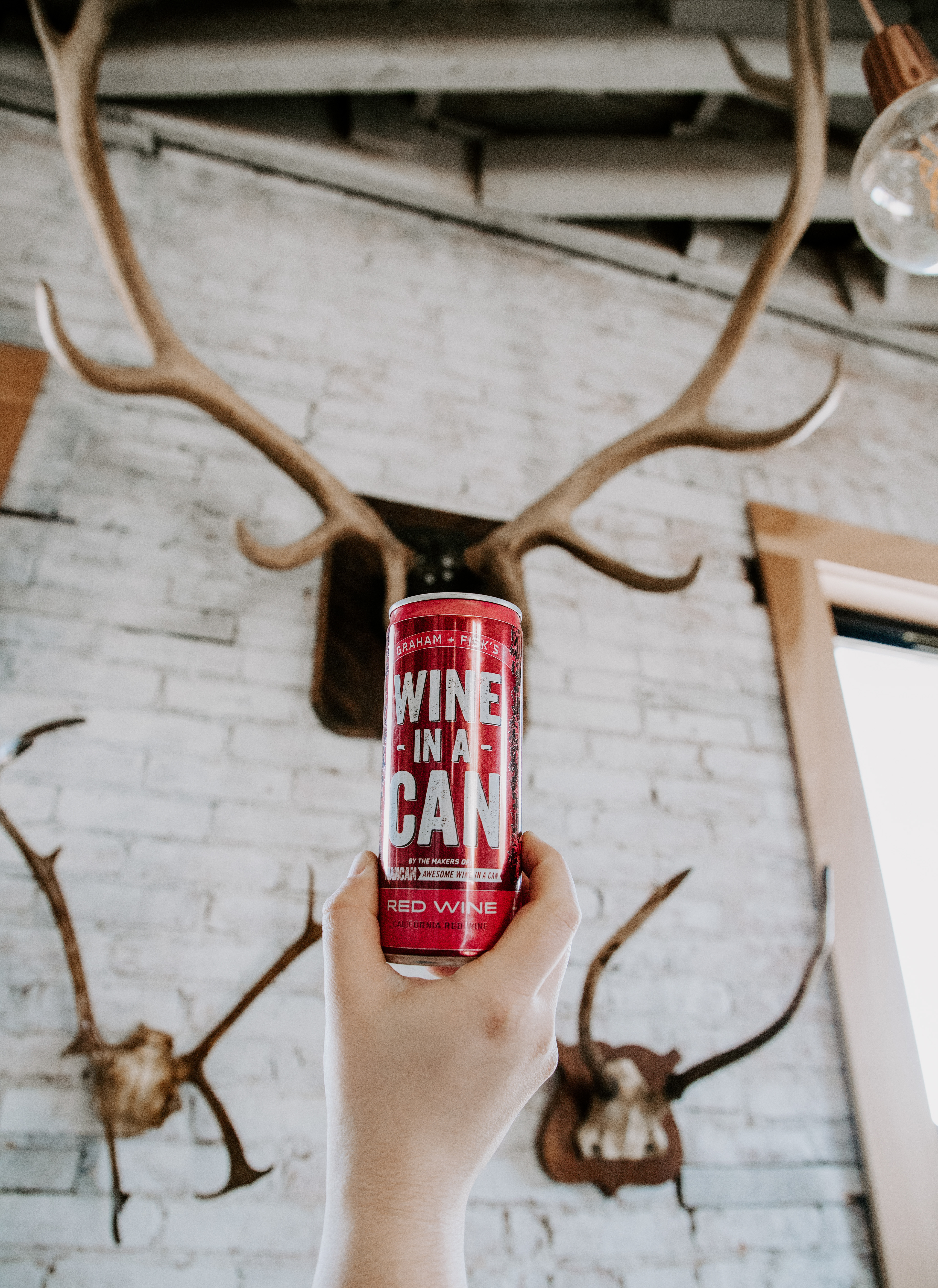
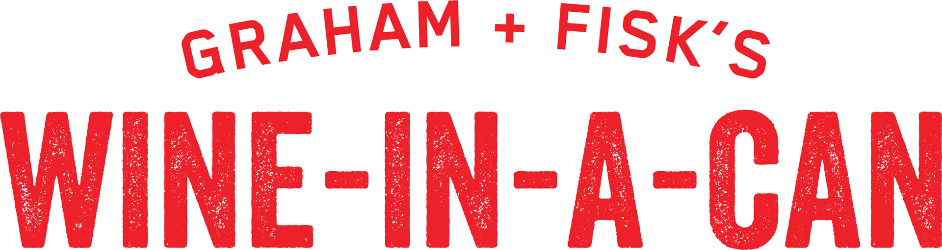
The Graham + Fisk's logo utilizes Firehouse Can Co. familiar font families such as the rough and tough Veneer which adds a lot of texture and personality, paired with Blender in Medium weight for the duo's names.
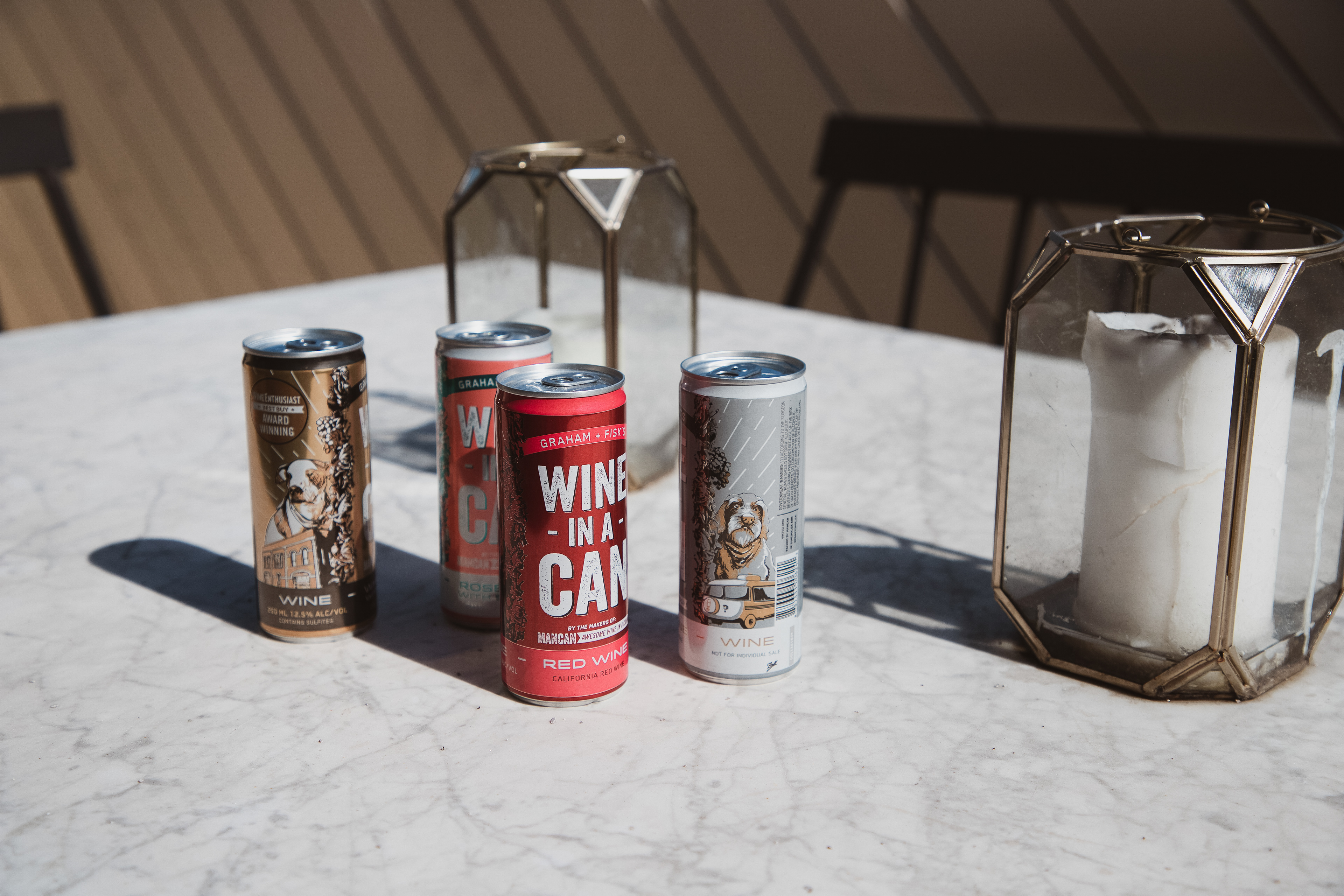
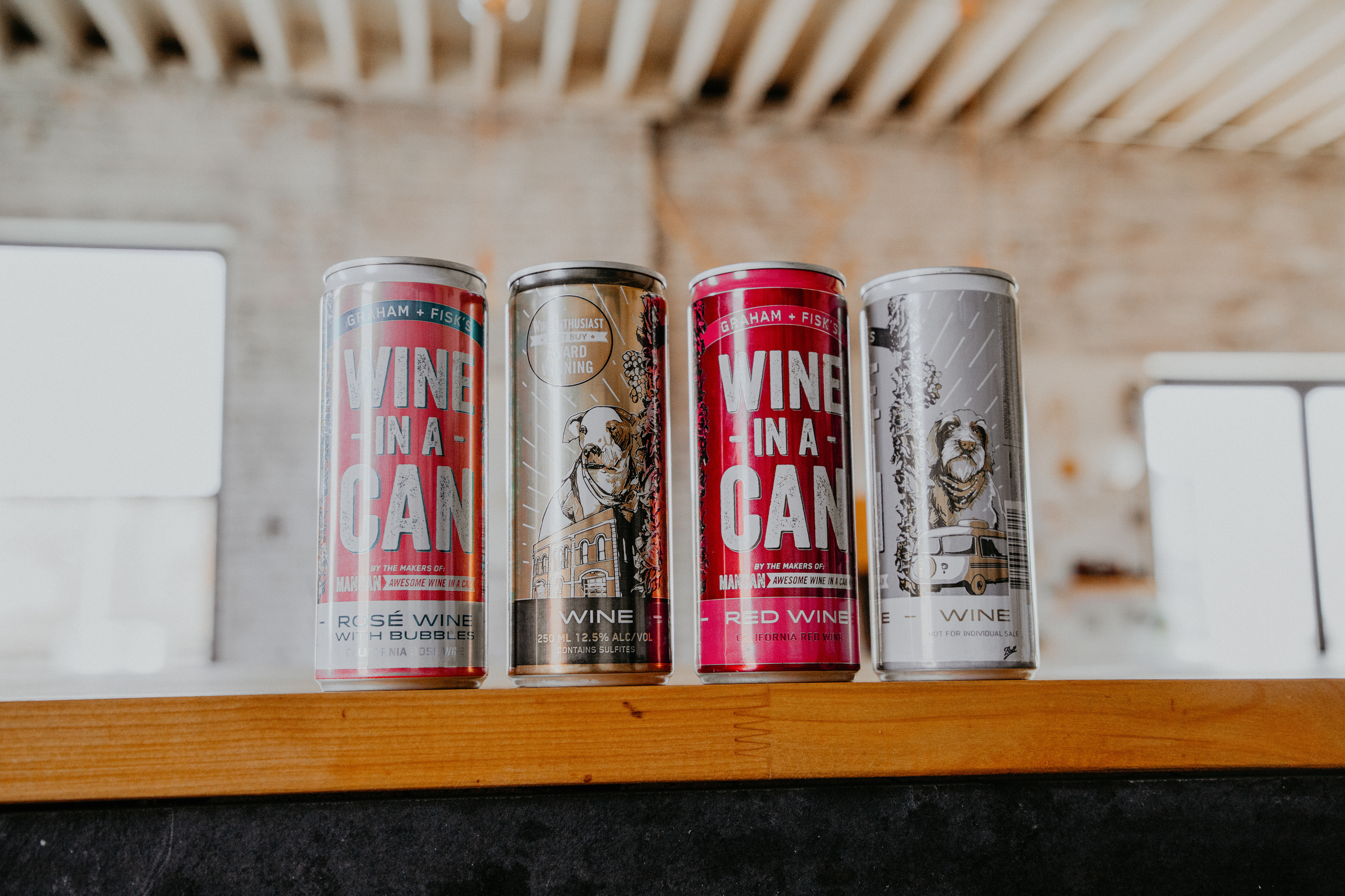
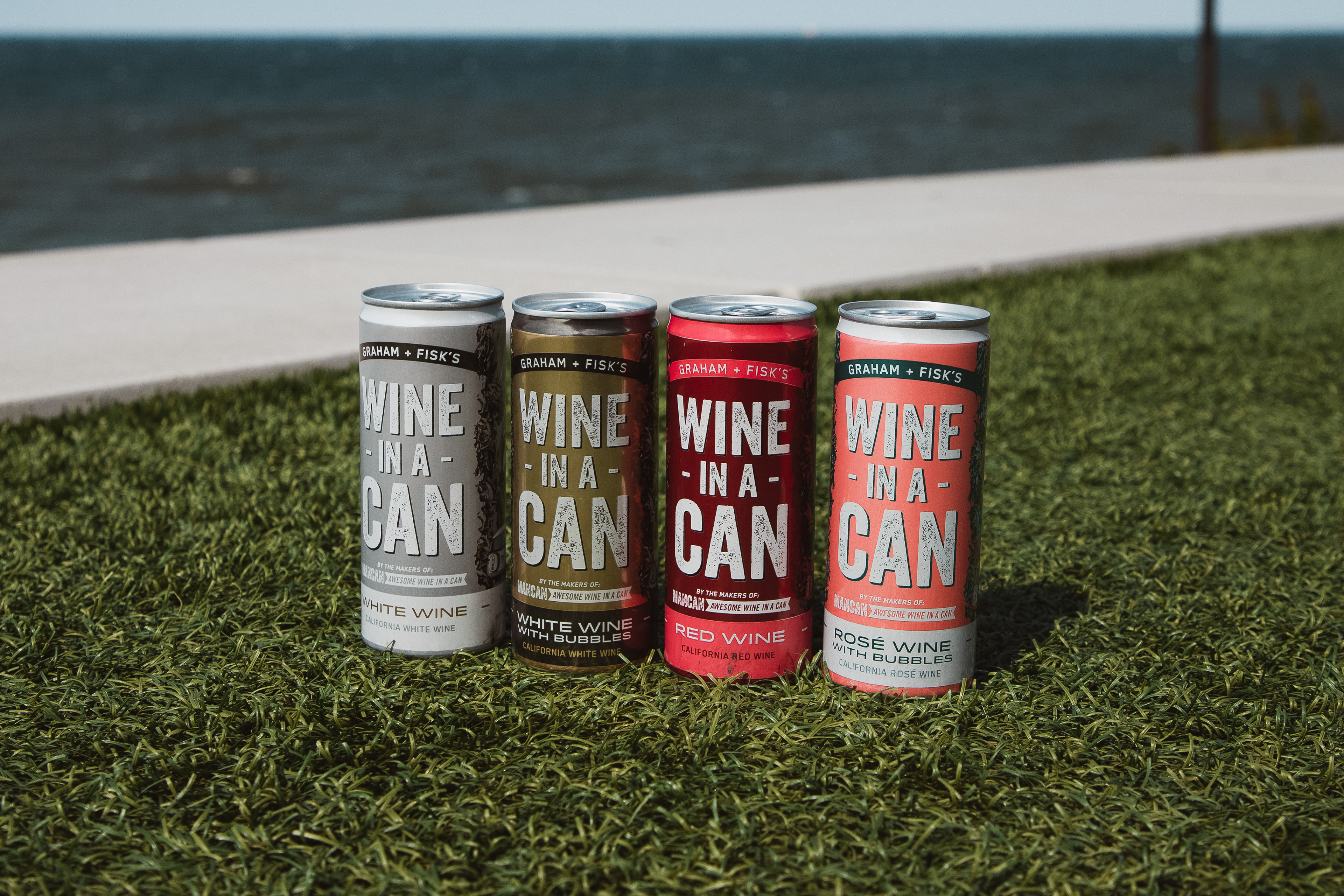
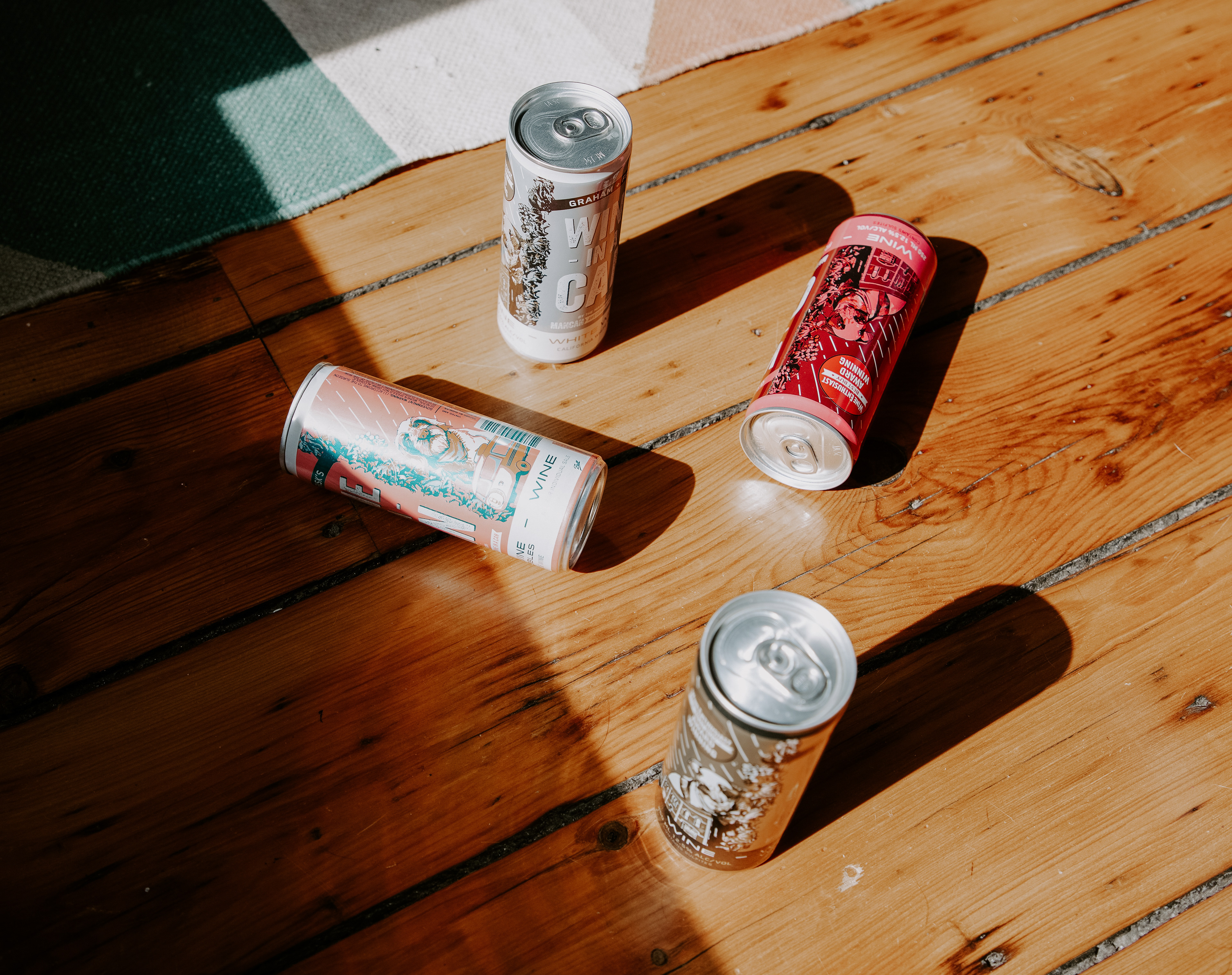
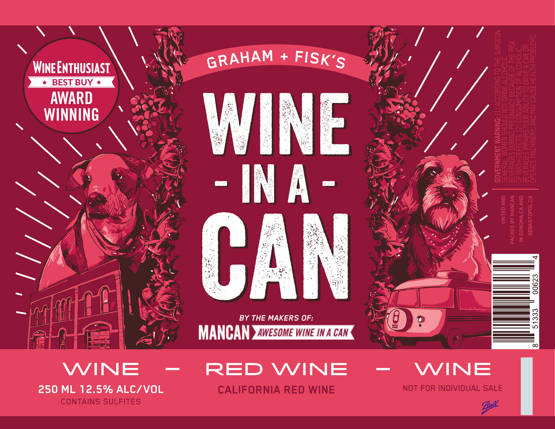
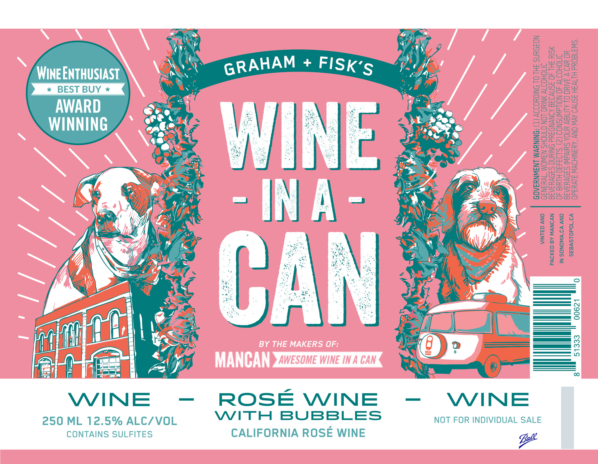
The can design direction was intended to utilize familiar typefaces, color pallets, and imagery as the MANCAN Wine Cans as seen below. However, a new addition of "Crosby the Dog" was added to the G+F's cans as Crosby is Fisk's dog, and Gracey (the other dog illustrated) is Graham's.
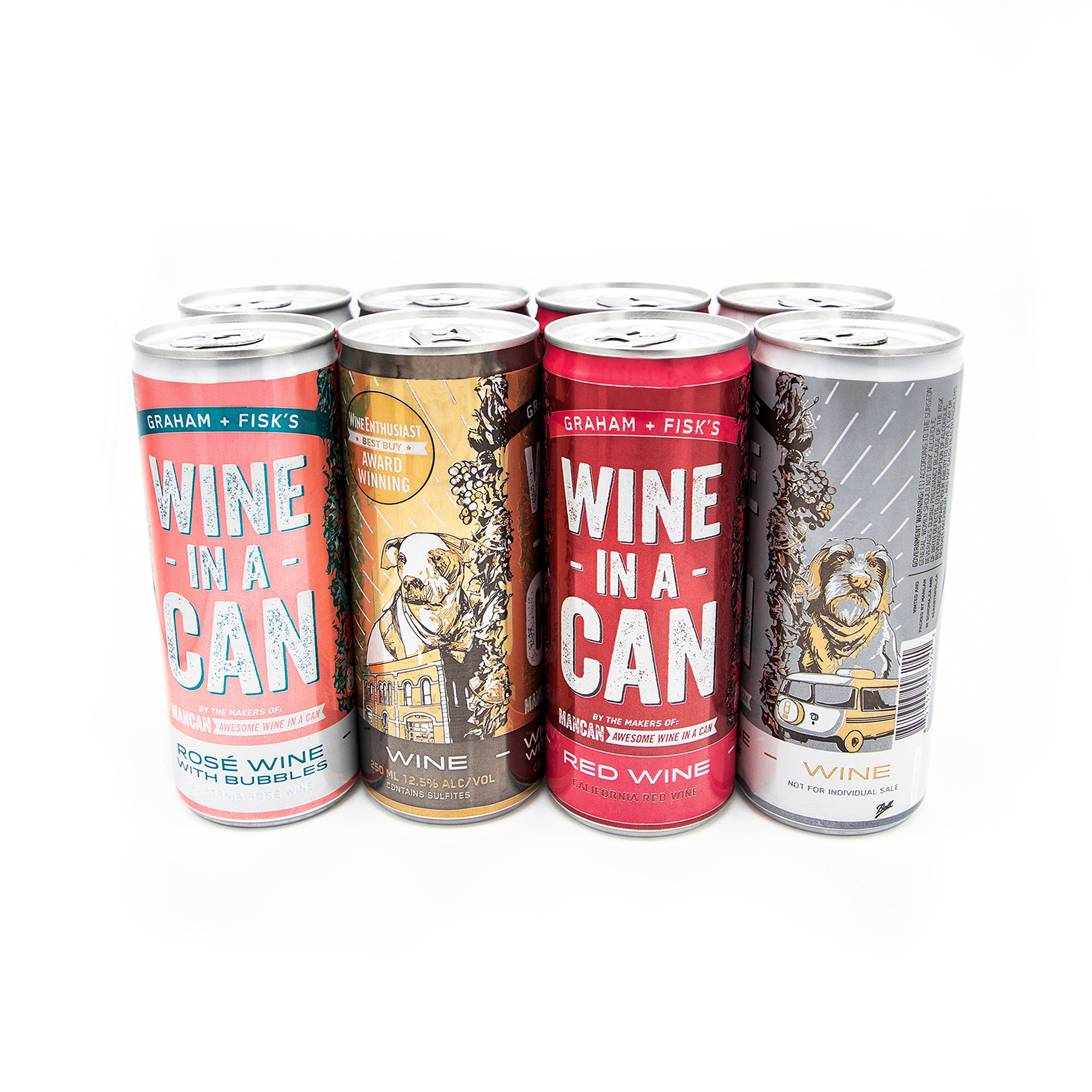
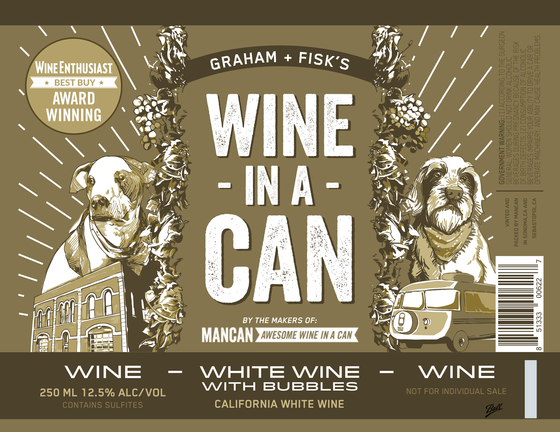
In this photo you can see both MANCAN and Graham + Fisk's together to see the unity and similarities of both can designs.